The dashboard in the menu item Statistics allows users to analyze SEEBURGER Message Tracking data through aggregated charts. Users have access to predefined views that can be customized and saved for future use.
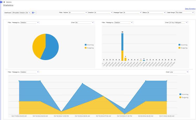
The dashboard is divided into three sections or dashlets: two narrow one-column sections at the top and one wide two-column section at the bottom.
At the top, users can choose from four templates:
Partner
Direction
Message Type
Status
When selecting one of the templates, the filters Message by of each dashlet change as well.
When hovering over Data information in the top right corner, a timestamp indicating the last time the aggregation job ran, is displayed.
Users can refine their analysis with the additional filtering options available in each dashlet. Additionally, users can select the preferred chart type to visualize the data. The available chart types include the following options:
Pie
Line
24-hour Histogram: Displays data divided into hours of creation
Daily Histogram: Presents data categorized by the days of the week of creation
Monthly Histogram: Organizes data based on the months of creation
Yearly Histogram: Segregates data by the years of creation
The top seven values for the selected filter Message by are prominently displayed for improved visibility. Any additional values are aggregated into the category Others, visually differentiated by gray shading. On the right side of each dashlet, users can easily deselect all displayed values by clicking on the squares in the legend.
Find more information here: